Since opening in 1971, Starbucks is today the largest coffee chain in the world, with over 18,000 locations worldwide. But when the coffee behemoth asked its customers what they thought of their store, they found that the brand was quickly becoming synonymous with fast food.
 So, how do you take a brand and make it less brand-y?
Starbucks has long prided itself on maintaining the local coffee shop image, but it’s quite the task to undertake when you are the go-to global coffee brand. When the company realized it was losing the touchstone of its appeal, it decided to do something about it.
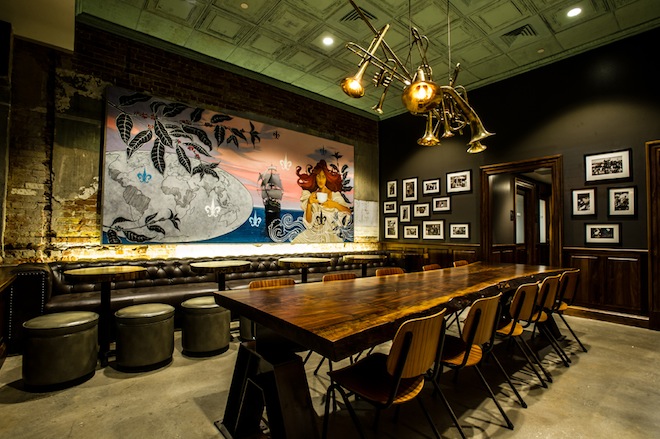
Beginning in 2008, the Starbucks brand began to relocate its store designers out of their Seattle headquarters, and into the communities they would be designing for. With a closer  connection to their consumer, they were able to make local modifications to the “standard kit” to ensure that they could maintain the “shop on the corner” feel, even if they were on every corner.
Although not every store will be a high-design store, the company does hope to bring these authentic touches to their most highly trafficked locations. In Switzerland, this included building a store on a train, while in Mexico, this called for doing away with secluded nooks and going areas where large groups could congregate. In the US, where consumers tend to frequent shops solo or in pairs, this meant more space where individuals could comfortably sit alone.
Despite the local feel they aim to maintain at  every store, Starbucks does keep a few consistencies across their stores: a “school house chair,” with a sturdy upright back; warm-colored ottomans; wooden tables and banquets. Even so, the color scheme may vary slightly, with lighter colors in warmer climates like Miami, or cooler seats in the American South.
You can read the full story on Wired.


 See More Blogs
Comments