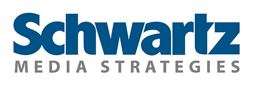


Developing our firm’s new logo over the last three months has been a labor of love. Between the brainstorming, the designing, the opining and the integration, we’ve vetted our new brand mark to the nth degree.
 We set out to ‘freshen up’ our old design in late 2011 and quickly realized that our ‘freshening up’ would be more like a ‘redesign.’ I’m told many companies experience this thought progression. They think the status quo is A-okay and then quickly realize that it’s not.
Our goal was to create a logo that was modern, straightforward and unique for its simplicity within our industry (call it the Apple approach) while also incorporating the idea that PR and marketing work together and in many cases evolve into one another. Many thanks to our good friend David Laidlaw of Laidlaw Creative, who is the mastermind behind the design.
David and his team created the “Schwartz” mark from scratch. It’s a homemade design, not a font. So that’s unique in and of itself. We preserved the words “Media Strategies” because we’ve built some equity in the name through our work, our relationships and our presence online and on social media platforms.
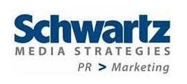
The final line — “PR > Marketing” — represents our approach to developing and implementing integrated marketing and social media campaigns that often evolve from our work on the public relations front.
Sounds simple, right? Not so fast. This was a democratic process. We shared the design evolution with our full team, our families, and anyone else who would listen. Hence, the three month long process. Needless to say, we’re very excited about the end result and we’d love to hear your thoughts. Feel free to sound off in the comments section below.


Comments